A phone is a phone is a phone
Andrew Marsh - one of our mid-50's Company Directors - discusses the current use of mobile phones, and its associated terminology.
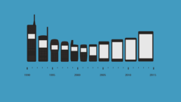
We still refer to our mobile device as a phone don’t we? “Where’s my phone?” we exclaim in exasperation, frantically collecting our keys, wallets/purses as we dash out the house. “What phone have you got?” we ask when we compare with the Joneses. The truth of the matter is that with modern day usage a mobile phone is not just for calling or texting anymore, however we still refer to it as a phone.
Some generations of mobile phone users deploy their phones for, almost literally, everything except calling or texting. Yes, I know, I’m a mid-50s Dad, but can I ever get hold of my teenage kids on their phones when I call or text them? The answer is, of course, an emphatic ‘No’ even although their phones are rarely more than six inches away at all times, day and night. It transpires that my teenagers hardly ever make or receive calls on their phones. This is an alien concept to them. And when I text them they tell me to message them instead. They use their phones constantly, but then that’s on message boards, social media, taking photos, ordering takeaways or taxis with equal ease and proficiency, making or watching videos and even streaming TV programmes or films. For this generation their phones aren’t phones at all. But they still regularly implore me with the mantra known to all parents, “Dad, I need a new phone”.
So what inspired me to pick on this topic? Well, I felt that it was my moral (and technical) obligation to speak up for the mid-50s masses who still use a phone as a phone in response to my colleague Sophie’s (our resident 25-year-old Account Executive) rather scathing review about the revived Nokia 3310. See her article here.
It got me thinking. This was a typical case in point where the mid-20s and younger still use the word ‘phone’ when an actual phone is practically the last thing they need.
"a truly simple, well-designed and reliable piece of kit"
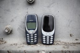
In the office Sophie was somewhat sceptical about Nokia’s re-boot of their all-time classic model mobile phone, stating (off the record, you understand) that it’s a rubbish phone and she doesn’t see why anyone would buy it. According to (25-year-old, don’t forget) Sophie, the phone in question doesn’t do this and doesn’t do that. In effect, she was zeroing in on what it doesn’t do and all the things it lacks compared to the state-of-the-art smartphones we’re all using these days. It was pretty negative stuff I thought, rather than focussing on the real raison d’être for this piece of equipment: a truly simple, well-designed and reliable piece of kit… for when all you need is a phone to actually call and text. In debating the Nokia 3310 I highlighted the fact that it seems to be a really good phone, with robust build, good connectivity, long battery life, and it’s simple and uncomplicated. And as phones go it’s also very cheap.
So all in all an excellent phone and I feel that it will have many more users than Sophie pointed out in her article: the elderly, festival goers, phone detoxers and simply Nokia fans.
Purely because it seems to be a good old phone, then yes, the Nokia will have a wider range of users than perhaps at first expected, including users who want a reliable telephone, that doesn’t store very much personal and financial data, that they can use cross-borders without the risk of confiscation and that doesn’t compromise their personal identity and security. In this age of clever hackers we shouldn’t overlook the attraction of protecting our omnipresent identities.
I’ll come back to my original conundrum: why do we still refer to our phone as a phone? So what should we call this magical piece of equipment that we port around with us everywhere we go? This all-encompassing mobile device, performing the full suite of functions of a computer, with touchscreen interface, camera, Internet access, messaging facility to (almost) the entire global population and an operating system capable of running any form of downloaded apps you could possibly choose. I think the Nokia 3310 is a phone in its traditional sense. But the kit in everyone’s hands is far from being merely a phone. Although ‘mobile device’ seems a precise descriptor, even I would agree that those are four clunky syllables rather incongruously strung together. And ‘phone’ rolls off the tongue rather more easily…
Will anyone buy the revived Nokia 3310?
The world went crazy when the Nokia 3310 revival was announced, but will anyone actually buy it? We asked Sophie, our 25-year-old Account Executive, what she thinks.
In a questionable move to promote their latest smartphone, Nokia announced the revival of everyone’s favourite first mobile: the Nokia 3310. The limelight was instantly on the 3310, leaving any thoughts of their shiny new release in the dust. Does anyone even know what their new phone is called, or the features of it? Nope, not me.
So let’s talk 3310. Originally released in 2000, the phone was a huge hit with mobile users. At the time it was revolutionary – not only could you make calls and send texts remotely, but you could choose from multiple ringtones (and even create your own), play games and… Did I mention make calls and send texts remotely? Admittedly it’s hard to remember what the phone COULD do as opposed to now what it CAN’T do.
"A modern classic reimagined" - Nokia
So why have we come full circle? Looking back, the original 3310 has features I’m envious of even 17 years later.
It was indestructible. You could throw it onto concrete ground and it wouldn’t even crack your beloved personalised cover.
The battery lasted forever (OK, a week). Apart from when taking the phone out of its packaging for the first time, does anyone remember charging their 3310? The battery went on and on and on and on and…
Snake. Before Angry Birds and Candy Crush, there was Snake. The real MVP of the mobile gaming world, it still remains a sought-after classic.
However, there’s a huge, massive, BUT to this story. It’s been 17 years. Technology has moved on. We have moved on. We use phones differently now.
A lot has changed in seventeen years.
The new Nokia 3310 has SO MANY missing features from both modern day smartphones and the classic 3310, it’s almost embarrassing. Here are a few crucial missing features:
There is no internet. Well, with due respect, apparently there is a basic browser that can access basic versions of Facebook and Twitter. I’m not convinced.
There is no Wi-Fi. I’m not sure why you’d even bother to access the limited internet on Wi-Fi, but hey, you don’t have a choice either way.
The camera is rubbish. At 2MP, it’s a long way away from today’s phone cameras. Good luck uploading your rubbish photos to Facebook from your phone.
Snake isn’t Snake. This one I’m almost offended by. One of the main draws of the revived 3310 is that users can play Snake again, but this Snake is completely different. This one moves diagonally, in colour (reminiscent of Snake II), and it just looks wrong. Bad move Nokia.
No WhatsApp. Yep, that’s right. The new Nokia 3310 doesn’t support WhatsApp, the world’s most used messaging service.
The old-style keyboard. You’ll probably never forget how to text on a 3310 and just how fast you were at doing so. But part of the reason we were so good at texting on a 3310 was because everyone used text talk, back in the days when we were charged per character. With today’s intelligent spellcheckers and predictive texting, I think users will get fed up of the old school keyboard fairly quickly.
The battery life isn’t THAT great. Granted, any phone that lasts a whole day with vigorous use is music to my ears, but the classic 3310’s battery could last up to a week. The new 3310 battery is said to last anywhere from 22 hours up to one month (albeit on standby mode – so basically not using your phone at all). Useful.
"Play the legendary Snake" - you're not fooling me Nokia.
So who’s actually going to buy this phone? Here’s my comprehensive list:
- Elderly people
- Festival goers
- Phone detoxers
- People who only want to call and text
- Die-hard Nokia fans
…that’s it. No one else will buy, and more importantly, use this phone. At only £42, I suspect people might buy the revival just for laughs. It’s been called a “dumb phone” for a reason.
A quick “raise your hand” in our office revealed that no one will be swapping their smartphone for a 3310. Sorry Nokia, but I think you’ve gone too far on this nostalgia trip. And give us the original Snake back.
Business cards, do we still need them?
A resounding Yes!
OK, we live in a digital networking age where everyone can be found online somewhere – a corporate website, a social media channel, a PR piece, Blog post, whatever. But no matter how digitally advanced we are your business card often remains a potential customer’s first contact with you and your company.
The old saying still stands: you never get a second chance to make a first impression. A business card connects with a new prospect on a personal level, encourages them to find out more about you and what you do. A well-designed, simple, impactful business card does this. Here are some of our most practical tips on creating a distinctive and professional card.
1. Logo and tagline
You may think it’s a ‘no-brainer’ but I can’t tell you how many business cards we’ve come across with either no logo at all or, possibly even worse, a really ill-conceived or blurry or smudgy logo.
And what, precisely, is the purpose of knowing your company is XYZ Solutions if you don’t let me know what solutions you could bring me? Think about a four- to five-word company descriptor, that is clear and precise, and hey presto, you’ve got your tagline.
Your logo and tagline are extensions of your brand, and your business card needs to convey your business to your audience in a powerful and memorable way. Your prospects should be able to identify your brand and instantly recognize it wherever they see it in the future – on your website, your portfolio, your email signature, or your premises.
2. Name and job title
Seems obvious, doesn’t it? It’s likely that business cards have the contact’s name on it. But if they do have a job title, then that doesn’t necessarily tell you what role they perform in the organisation.
Let’s start with the name. My name is Andrew, and it’s always Andrew. It’s never Andy. So many times I’ve been given a card from an Andrew / Katherine / Stephen and I’m immediately told that they go by the name Andy / Kate / Steve. If that’s the case, and you want to make a personal connection with the prospective new customer then put the name you want to be known by on the card. But let’s just stick to real names and avoid at all costs nicknames or buddy names.
When I see a job title on a card I want to know what that person actually does. Quite how much help is it (besides finding out how high they sit in the company’s organogram) to find out this person is a Managing Director or Partner or Director? By the time I’m back at the office I’m not sure what the person’s job was or why I should call them. So, Jane Jones, Partner, ABC Financial doesn’t tell me much. But Jane Jones, Corporate tax expert and Partner, ABC Financial does.
3. Contact Information
OK, we’ve come this far. You’ve met someone interesting. You’ve impressed them with your brand, and it’s clear to them what you do and how you can help them. As they are passed from hand to hand, business cards create a personal connection between you and your contact. Now you need them to get in touch following this meeting.
The contact information is the substance of the business card. You need to make it as easy as possible for people to contact you. But which of all your contact details should you include? The key here is that you want this person to contact YOU. You want to make it easy for them. So it would be counter-productive to send them through a labyrinth of gatekeepers and digital dead-ends. Let them have your direct contact details.
Email addresses such as info@ or office@ are generic and impersonal and frustrating, as are switchboard telephone numbers or voicemail hell.
Lots of business cards these days don’t include a physical address on their business cards. Leave this out if you’re struggling for space. But include it if your business model is local, or related to a geographical area. Often, prospective customers may specifically want to do business with a local firm.
Make sure the card doesn’t look cluttered – space is good! Don’t be tempted to overstuff it with detail as this will not have a positive impact.
A good business card is an extension of your brand, and needs to be memorable and impactful, appealing to all the senses.
4. Social media profiles
You should always include your social media profiles on your business card, as they have now become indispensable if you want to connect and engage with your target market. But you don’t have to use all of them. Your social media profile is important as, with a lot of your potential target audience, if you’re not on social media then you don’t have a public profile.
But don’t overwhelm your audience. Remember what we said above about being clear and easy, and that space is good? You don’t need to list all your social media accounts on your business card. Think strategically about your accounts and only list the few channels where contacts can get an overall impression of your business and the ones you’re most active in.
If your business has several social media accounts then a good tip is to ensure that all the handles on your multiple channels are the same, for example @abcfinancial You could then simply display on your card: social @abcfinancial People these days are knowledgeable enough to know to search the various channels using your handle.
5. Use the back of the card
Always use the back of the business card! This is free advertising space. You’ve managed to get your card in you contact’s hand and one of the first things they’ll do is flip it over. I always do, but maybe that’s because I’m a marketer.
This space is free space to highlight your branding or messaging. Whatever you do, use it wisely and make it memorable. You can use your logo and brand, photos, brand statements, a short company descriptor – anything memorable.
6. Production values
Without naming names, we recently designed a fabulous business card for one of our clients which ticked all the boxes above. When it came to printing the cards, some bright spark within the operation thought they would earn brownie points with the boss by sourcing a much cheaper print quote than we supplied. And the boss went with this cheaper quote. Although the business cards were beautifully and effectively designed, when printed they looked exactly what they were – cheap and nasty and, frankly, an embarrassment to the company.
You’ve come all this way, so don’t fall at the last hurdle. Once your design and content are spot on, push the boat out and produce quality cards that have the required, positive impact with your new contact. Engaging more than one sense at a time – in this case, touch and feel – improves recall, so people will be more likely to remember your business, in a positive way, if you have high production values.
Thicker cards feel more expensive and they make your business seem more professional. You should also consider having a good finish, something like a matt or gloss laminate. There are a wide range of finishes available, so speak to your printer (or a good agency) and do the right thing.
A parting word: A good business card is an extension of your brand, and needs to be memorable and impactful, appealing to all the senses. It should convey, clearly and concisely, the right information about who you are, what you do, and the easiest ways possible of contacting you.


